Design Statements
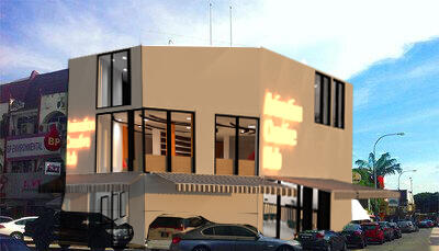
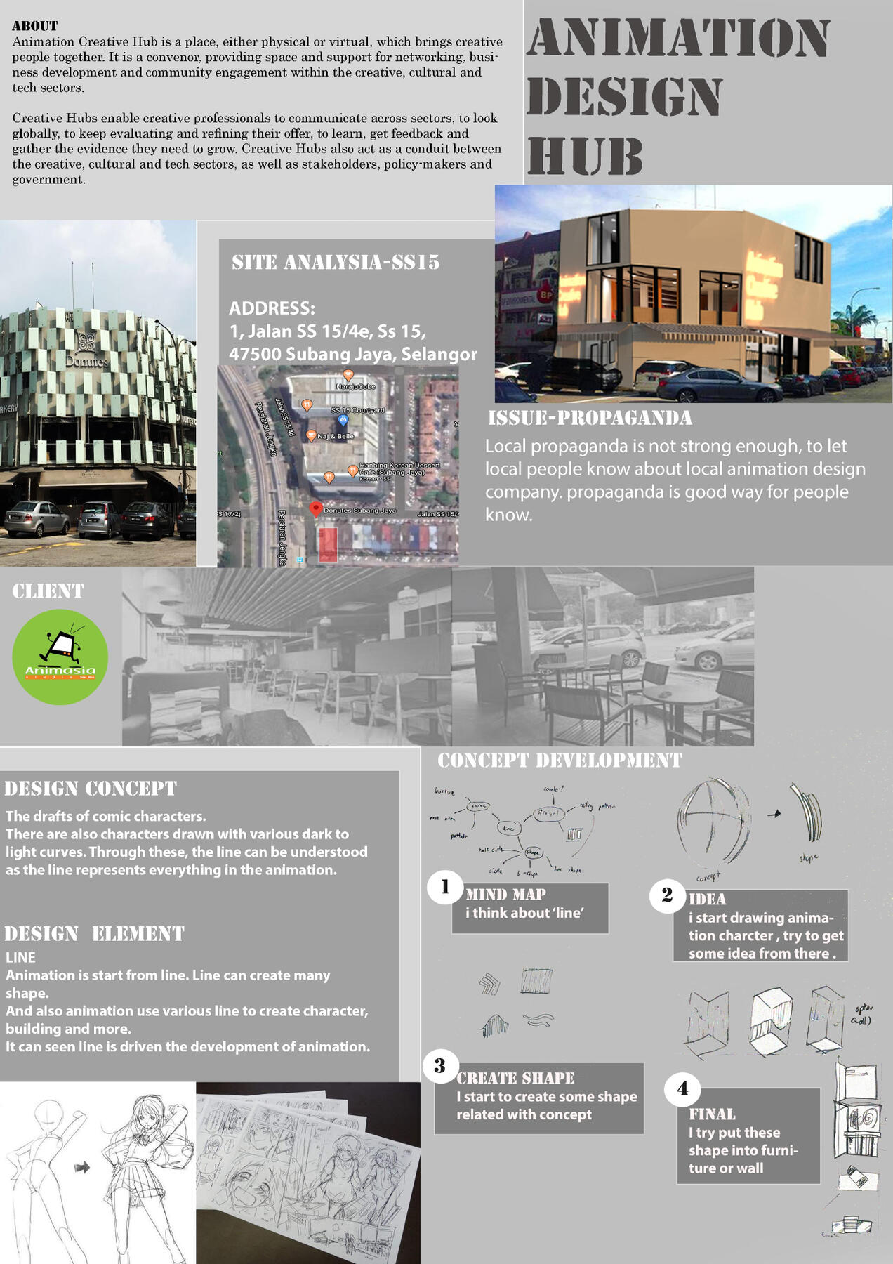
The origin of this design comes from the drafts of comic characters. The line is an important thing in animation design, so use the type of line to design it. The animation is starting from the line. The line can create many shapes. In the drafts, there are various lines. For example, the drafts of building drawn with the straight line and horizontal lines. Curved lines are lines that bend and change direction gradually. They can be simply wavy or spiral. Such lines convey the feelings of comfort and ease, as well as sensual quality as they remind us of the human body. The curve line focuses on character action because a straight line can kill some pose and make the animation looks uninteresting, so the need to use some curve to make the characters’ movements more vivid. There are also characters drawn with various dark to light curves. Through these, the line can be understood as the line represents everything in the animation. The animation uses a variety of lines to form.
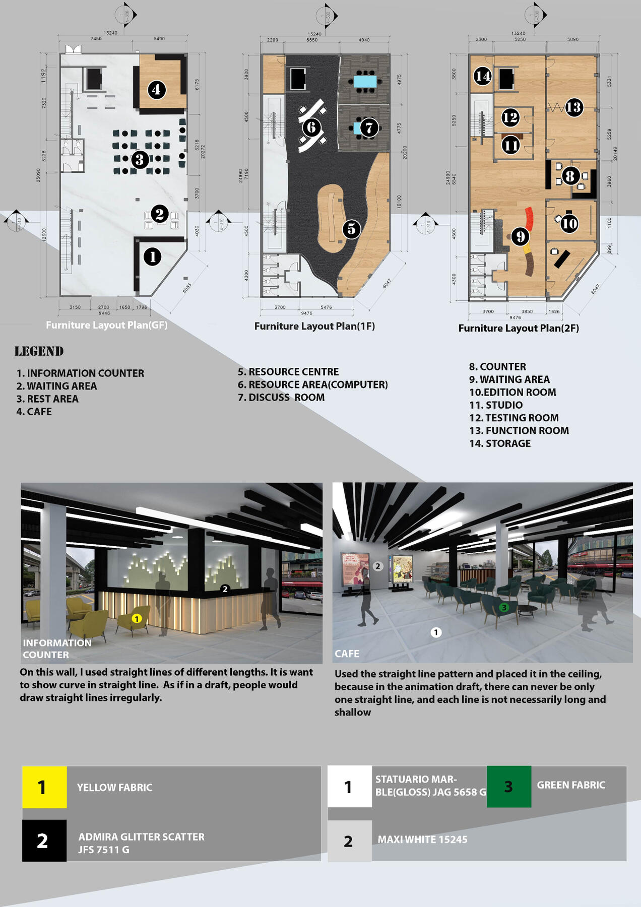
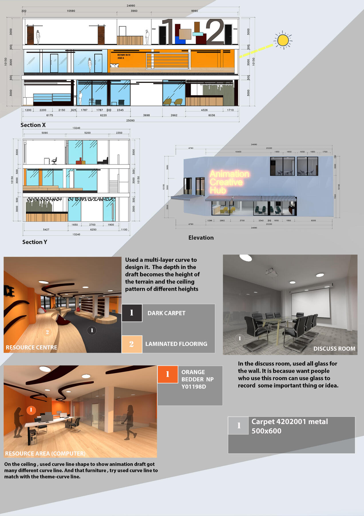
First, wanted to use a variety of lines to combine the elements of modern. For this, every floor is used different types of lines to design. For example, the grand floor is formed by straight and horizontal lines. The ceiling will be composed of different lengths and different shades like a draft comic animation. As if in a draft, people would draw straight lines irregularly. Use this irregularity in-ceiling and furniture. On the wall behind the information counter on the grand floor, straight lines of different heights are also used and the principle of light is used, so that the lines of different height will also be bright.
Also, for example, the first floor is fully made of curve lines. On the first floor, the depth in the draft becomes the height of the terrain and the ceiling pattern of different heights. This is because the depth in draft represents which is the front and back. And also use these lines on furniture, so the furniture will curve like the same. On this floor, you will see various heights.
Besides, on the second floor, the shapes from various compositions are used. In the draft, the lines are composed of squares and rectangles. You will also see it on this floor. On the second floor, the wall outside the room will also use various shapes to display. So the concept comes from these lines and meaning at animation design.
© 2020 by INTI Center of Art & Design. Proudly created by the ICAD Voyage Showcase Committee.


